Content
Try for freeWeb2App funnel compliance guide
Growth
June 18, 2026
Growth
June 18, 2026

How to build high-converting web funnels without creating unnecessary compliance, chargeback, or payment processor risks.
Introduction
Web2App funnels are one of the most powerful growth tools for mobile apps. They help teams explain product value before the app install, personalize the web funnel, test offers faster, and create more flexible monetization flows than a standard in-app paywall.
But with more flexibility comes more responsibility.
A web funnel can be aggressive in sales and still be transparent. It can use strong hooks, emotional messaging, urgency, discounts, trials, quizzes, upsells, and personalized offers, without misleading the user.
The goal is to make funnels scalable, while keeping them effective.
A funnel that creates confusion around pricing, renewals, cancellation, or refunds may generate short-term revenue, but it can also create long-term problems: chargebacks, refund spikes, support overload, payment processor warnings, account holds, and regulatory risk.
This guide explains the key principles of building a compliant and scalable Web2App funnel.
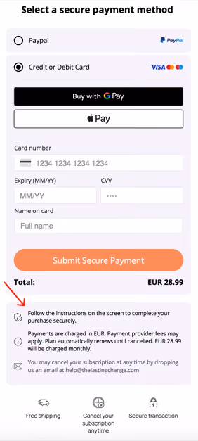
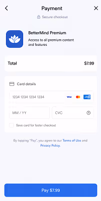
1. Make the offer clear before payment
The user should understand what they are buying before they enter payment details.
This sounds obvious, but many funnel problems start here. A user may complete a quiz, receive a "personalized plan", and then see a low-price offer without fully understanding whether they are buying a one-time product, a trial, a subscription, or an add-on.
A compliant funnel should make the offer easy to understand at the moment of purchase. The payment screen should clearly answer:
- What product or service is included?
- Is this a one-time payment or a subscription?
- Is there a trial period?
- What happens after the trial ends?
- How much will the user be charged today?
- How much will the user be charged later?
- How often will billing happen?
A good rule: if a reasonable user could leave the checkout screen thinking they made a one-time purchase when they actually started a subscription, the screen needs to be improved.
2. Do not hide subscription terms in small print
Subscription terms should not be technically present but visually invisible.
A common mistake is putting the subscription disclosure below the main CTA, in small grey text, or in a location where users are unlikely to read it before paying. This creates risk because the user may not have clearly understood the recurring nature of the purchase.
Important subscription terms should be close to the payment action and visually readable. The user should see:
- The recurring price
- The billing interval
- The renewal condition
- The trial duration, if applicable
- The date or logic of the next charge
- How cancellation works
This does not mean the checkout page has to look ugly or overloaded. Good design can make legal and billing terms clear without destroying conversion.
In many cases, clarity improves the quality of conversions because users who understand the offer are less likely to request refunds or file chargebacks later.
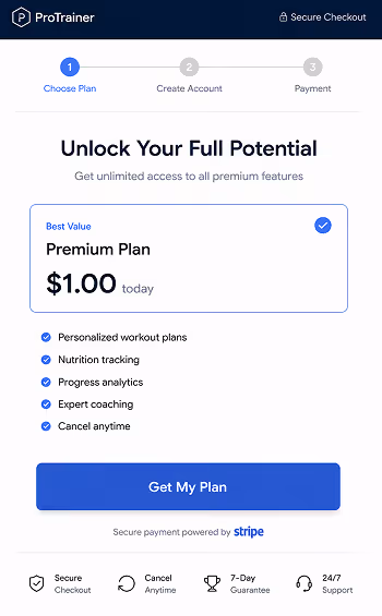
3. Avoid making a subscription look like a one-time purchase
One of the biggest risks in web funnels is when the user believes they are buying a single item, but the product is actually connected to recurring billing.
This can happen with offers like:
- "Get my plan"
- "Unlock my report"
- "Download my PDF"
- "Start for $1"
- "Get results now"
- "Continue"
These CTAs are not automatically bad. But if the offer is a subscription, the surrounding copy must make that clear.
For example, "Get my plan" can work if the screen also clearly says:
Today: $1 trial. Then $29.99/month unless canceled.
The CTA is rarely the issue. The risk comes from the gap between what the user thinks is happening and what will actually happen. A compliant checkout reduces that gap.
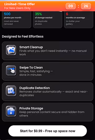
4. Make trial offers easy to understand
Trials are powerful, but they are also one of the highest-risk parts of subscription funnels.
A user should understand the full trial logic before payment. If the offer is "$1 trial", "7-day trial", or "limited-time trial", the screen should explain:
- How long the trial lasts
- What the user pays today
- What happens when the trial ends
- What the full recurring price will be
- When the first full charge will happen
- How the user can cancel before renewal
Avoid presenting the trial price as if it is the full product price. For example, if the user sees "Start for $1" as the main pricing message, but the product renews at $39.99/month, the renewal price should be visible and easy to understand before payment.
The renewal price should not feel like a surprise later.

5. Be careful with upsells and add-ons
Upsells can increase revenue, but they can also create confusion if users do not clearly understand what they accepted.
Each upsell should be treated like a separate purchase decision. The user should understand:
- What the add-on includes
- How much it costs
- Whether it is one-time or recurring
- Whether it changes the subscription price
- Whether it starts another subscription
- How to decline it
Avoid preselected add-ons, unclear buttons, or layouts where the user may accept an extra charge by mistake.
If users later say, "I didn't know I bought this," the upsell flow probably needs to be redesigned.
A good upsell creates value and feels intentional. A risky upsell creates surprise charges.

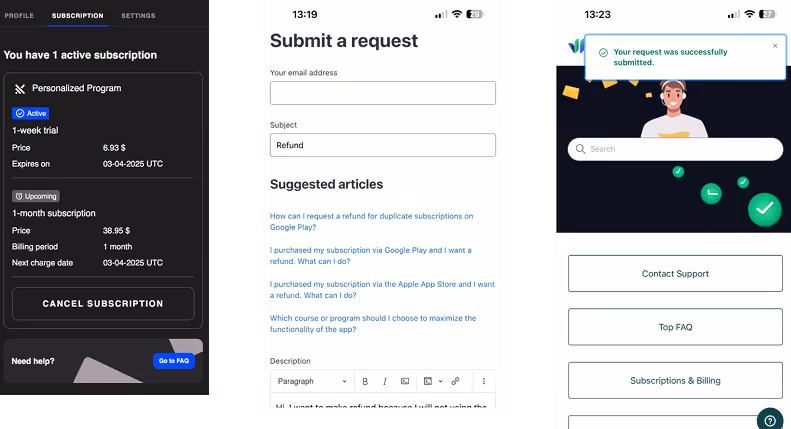
6. Make cancellation simple and accessible
A funnel is not only the pre-purchase experience. Cancellation is part of the product experience too.
Users should be able to cancel without unnecessary friction. A scalable subscription business should provide a clear cancellation path. Ideally, cancellation should be available through a self-service flow, without requiring the user to email support and wait for a manual response.
A good cancellation flow should:
- Be easy to find
- Work on mobile
- Show the current subscription status
- Confirm cancellation immediately
- Send confirmation by email
- Stop future charges reliably
- Allow support to verify cancellation status quickly
Retention offers can be part of the cancellation flow, but they should not block the user from canceling.
A cancellation flow can try to retain the user while still letting them leave easily.
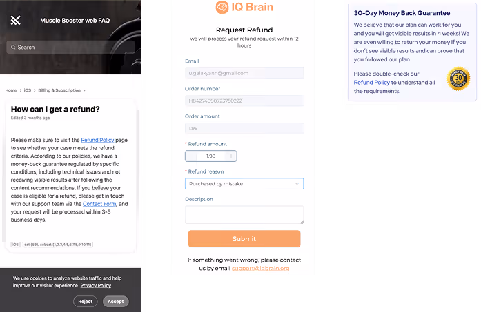
7. Make refund terms visible and specific
Refund policies should not be vague. If a funnel promises a "money-back guarantee", the actual terms should be easy to understand.
The user should know:
- How long the refund window lasts
- What conditions apply
- How to request a refund
- What is excluded, if anything
- How long refund processing may take
- Which support channel to use
Avoid making a strong refund promise in marketing copy and then adding restrictive conditions in a hidden policy page. This creates frustration and can increase disputes.
The refund policy should match the user's reasonable expectation from the offer page.
8. Be honest about personalization
Many Web2App funnels use quizzes and promise a personalized plan, report, program, or recommendation. This is a strong conversion mechanic, but it must be accurate.
If the funnel says the result is personalized, the product experience should actually reflect the user's answers. Personalization does not need to be perfect, but it should be meaningful.
Be careful with claims like:
- "AI-generated plan"
- "Expert-based recommendation"
- "Doctor-approved program"
- "Personalized for your body type"
- "Custom plan based on your answers"
- "Scientifically proven"
These claims create expectations. If the final experience does not match them, users may feel misled.
A safer approach is to be specific about what is personalized. For example:
- "Your onboarding answers help us recommend a starting plan."
- "Your plan is adjusted based on your selected goals and preferences."
- "We use your answers to personalize content recommendations."
The more specific the claim, the easier it is to support.
9. Send a clear confirmation email after purchase
The post-purchase email is an important compliance and trust touchpoint. After payment, the user should receive a clear confirmation that explains what happened.
The email should include:
- Product or plan purchased
- Amount charged today
- Subscription terms
- Renewal price
- Billing interval
- Next charge date or renewal logic
- Cancellation instructions
- Refund policy link
- Support contact
- List of accepted add-ons, if any
This email helps reduce confusion and gives users a reference point. It also helps support teams because users can find answers without opening a ticket.
A strong confirmation email works as part of your risk reduction system, beyond a simple receipt.
10. Monitor chargeback and support signals
Compliance is not only about what the funnel says. It is also about how users react after purchase. Your data will often show problems before they become serious.
Watch for patterns such as:
- Users asking "Why was I charged?"
- Users saying "I thought it was a one-time payment"
- Users saying "I couldn't cancel"
- Users asking for refunds immediately after renewal
- Users disputing add-on charges
- High decline rate after the first renewal
- Payment processor warnings
- Increasing chargeback ratio
- Support tickets about duplicate charges
- Negative reviews mentioning hidden subscriptions
Treat these as funnel feedback, not only support tickets. If many users misunderstand the same part of the offer, the funnel should be changed.
A good team does not only optimize conversion rate. It also optimizes for refund rate, dispute rate, renewal quality, and long-term customer trust.
11. Review the full user journey, not only the checkout page
Compliance problems often happen because teams review screens separately. But users experience the funnel as one continuous story.
- The ad creates the first expectation.
- The quiz develops that expectation.
- The result page makes a promise.
- The paywall turns that promise into an offer.
- The checkout page creates the purchase decision.
- The email confirms what happened.
- The cancellation flow defines whether the user feels respected.
All these steps should tell the same story.
- If the ad says "free", the checkout should not surprise the user with recurring billing.
- If the quiz promises a custom plan, the product should deliver meaningful personalization.
- If the paywall says "risk-free", the refund policy should feel risk-free.
- If the offer says "cancel anytime", cancellation should actually be easy.
The strongest compliance review walks the full journey from the user's point of view.
12. Build compliance into growth operations
Compliance should not be something the legal team checks once at the end. For Web2App funnels, compliance should be part of growth operations.
Every time the team launches a new offer, pricing test, upsell, trial, or checkout design, they should ask:
- Will users clearly understand what they are buying?
- Will users clearly understand the recurring billing terms?
- Can users cancel without friction?
- Are refund terms aligned with marketing claims?
- Are personalization claims accurate?
- Could this screen create unnecessary chargebacks or support tickets?
This does not slow down growth. It protects growth.
A funnel that converts well but creates payment disputes is not truly optimized. A funnel is truly optimized when it converts, retains, and scales without creating unnecessary risk.
Final principle
A high-converting funnel persuades users while keeping the offer clear.
The user should always understand:
- What they are buying
- How much they are paying today
- Whether they will be charged again
- When they will be charged again
- How they can cancel
- What refund terms apply
If those points are clear, the funnel is much more likely to scale safely. If those points are hidden or confusing, the business may see short-term revenue, but it also increases the risk of refunds, chargebacks, support problems, payment processor issues, and regulatory attention.
The future of Web2App belongs to teams that can combine performance marketing with user trust.
At web2wave, we help mobile apps build web funnels that are not only high-converting, but also more transparent, scalable, and resilient.
Share this Article
Build your web funnel with web2wave
Start using web funnels: Launch faster, convert better, and keep more revenue with no app store limitations