


Content
Try for freeHow to Improve Web2App Paywall Conversion
Growth
August 5, 2026
Growth
August 5, 2026

Most app teams spend put effort onto their quiz funnel and then treat the paywall as an afterthought. But the paywall is where revenue is either captured or lost, and the difference between a low-converting and a high-converting paywall almost never comes down to the quiz but to what happens in the last few seconds before someone decides to pay.
We put together 14 best paywall optimization practices based on what we see working across funnels built and tested on web2wave.
1. Show the price per day, not just the total
A $29.99 month plan sounds expensive to most users. At $0.99 per day, the same plan sounds reasonable. People naturally evaluate recurring costs this way, in subscription apps as much as in any other category. Daily spending feels proportionate to daily value, while a lump sum feels like a commitment.
The way to apply this is to make the per-day price the primary number displayed, with the total visible but secondary. Something like "1 month · $0.99/day · $29.99 total" gives users both frames without hiding either. Switching to per-day as the primary display has consistently improved paywall conversion in client tests on web2wave, by 25% on average, without changing the underlying price at all.
Strikethrough pricing follows the same logic. If you have a legitimate original price to anchor against, showing it gives users a concrete reference for the value of the discount. The original price should be real and the discount meaningful enough that it registers as a reason to act now rather than later.
.avif)
2. Use intro offers instead of free trials
The first payment is the highest-friction moment in the entire funnel. Once a user has paid, even a small amount, they are significantly more likely to stay through renewal than someone who has been on a free trial. Intro offers address this by lowering the initial price rather than eliminating it.
A common structure: the first billing period is heavily discounted (for example, the first month for $6.99 instead of $29.99), with the full subscription price applying from the second period onward. Terms are shown clearly at checkout so there is no ambiguity about what happens next. This is different from a free trial in one important way: users who pay, even a small amount, are self-selecting as higher intent. Free trials pull in a much broader audience, many of whom were never going to convert, and they tend to signal low purchase intent to ad platforms like Meta, which then optimizes toward more of that same audience.
One fitness app client on web2wave replaced their free trial with a $6.99 intro week and saw LTV increase by 30%. The reason was that subscribers who converted through the paid intro offer showed higher intent from the start. In addition, the initial charge generated immediate incremental revenue.
.avif)
Price strategy examples:
.avif)
3. Display Apple Pay and Google Pay prominently
Payment friction at the checkout form is one of the main reasons users who have already selected a plan do not complete the purchase. Manually entering card details on a mobile screen is enough of an interruption that a meaningful share of users will abandon rather than complete it, particularly if they need to get their card out.
Apple Pay and Google Pay bypass this entirely. The user authenticates with Face ID or Touch ID and confirms with one tap, which removes the card entry step and the friction that comes with it. The placement of these buttons matters more than most teams expect. Showing them under the plan options, before users scroll to the checkout form, catches users who are ready to pay immediately. Including them again inside the checkout form catches users who scroll past the first instance. Some users will use the first placement, some will use the second, and offering both does not create confusion.
Apple Pay and Google Pay are supported across all web2wave plans and can be configured in the paywall editor without code changes.
.png)
4. Add a personalized discount coupon with a countdown timer
A coupon with the user's name on it reads differently than a generic promo code. When a user sees "ANNA_NOW" applied to their plan alongside a timer counting down, it feels like an offer that was prepared for them specifically rather than a generic discount code anyone could use.
The personalization is straightforward to implement in web2wave: the user's name or email, collected earlier in the quiz, is passed into the paywall as a variable and inserted dynamically into the coupon display and the paywall header. The countdown timer is configured separately and tied to the session rather than a fixed end date. The combination of a named coupon and a visible timer creates two things at once: a sense of exclusivity around the offer and a reason to decide now rather than come back later. In client tests, personalized coupons with timers have lifted paywall conversion by 15% compared to standard paywalls without them.
.png)
5. Show users a visual of their outcome
People do not buy subscriptions to apps; they buy the outcome the app is supposed to help them reach. A weight loss app is not selling a macro tracker, it is selling the version of the user who hits their goal by a specific date. A language app is not selling lesson modules, it is selling the version of the user who can hold a conversation. The paywall is the right place to make that transformation concrete and visible.
Before-and-after graphics, projected progress charts that use the user's actual goal and timeline from the quiz, skill level indicators showing where the user is now versus where they will be in 90 days: none of these are decorative. They directly reinforce the reason the user completed the quiz and increase the perceived relevance of the offer. web2wave's paywall editor supports dynamic elements that pull in quiz answers, including goal weight, target date, and starting skill level, which can be fed into visual components that update based on what each user actually said.
.avif)
6. Test different CTA button wording
"Subscribe" frames the action as a commitment. "Continue" looks like the next step in a process that is already underway. That reduces friction and increases conversions.
Testing CTA wording is one of the simplest A/B tests to run because everything else on the paywall stays the same, which means any difference in conversion is directly attributable to the button text. In web2wave client tests, replacing "Subscribe" with "Continue" or "Get my plan" has produced conversion lifts up to 5% as a standalone change. The effect tends to be more pronounced on mobile, where the CTA is often the most prominent element visible on screen. Other variants worth testing include "Start my plan," "Unlock my results," and similar outcome-oriented alternatives that focus on what the user gains rather than what they are agreeing to.
.avif)
7. Make the money-back guarantee visible on the paywall
When a user reaches your paywall, they have no experience of your product yet. A prominently displayed money-back guarantee addresses that risk by removing the downside of being wrong.
The guarantee needs to be visible at the point where users are evaluating whether to pay, not buried in the fine print below the checkout form. Placing it near the plan prices, directly above the CTA button, or as a trust badge works well. The framing should be specific and unconditional: "30-day money-back guarantee, no questions asked" communicates both that the guarantee is real and that using it will not require a fight. Vague references to a refund policy do not do the same work.
.png)
8. Add a pre-checkout summary screen
A user who has selected a plan has already made an emotional decision to subscribe. The pre-checkout summary screen is designed to reinforce that decision and prevent last-minute doubts before they face the friction of the checkout form.
This screen sits between the paywall and the checkout form. It summarizes what the user is about to get: their personalized plan, the features included, the goal they are working toward, and the price. A countdown timer adds urgency and a CTA button moves them into the checkout. The summary screen works because it gives users a final, clear reminder of why they chose to pay before they encounter the highest-friction step in the flow. A user who clicks through from a strong summary is more committed than one who scrolls from the plan selector directly into a card entry form.
.avif)
9. Optimize the checkout form itself
The checkout form is where a significant share of drop-off actually happens.
Two things matter here.
First, remove any fields that are not strictly necessary. Every extra field is a potential exit point, and information that is not required for the transaction should not be there.
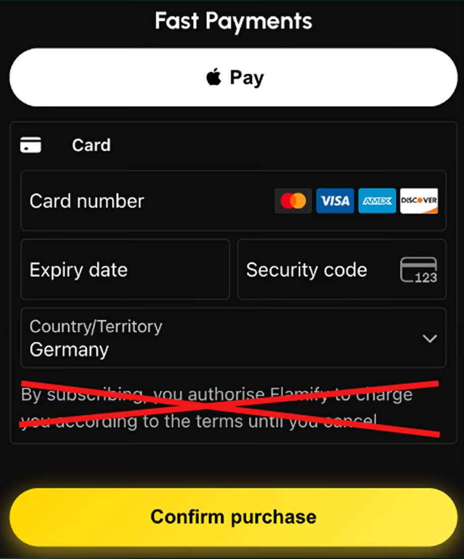
Second, add a value proposition to the checkout page rather than leaving it as a bare payment form. By the time users reach checkout, they are close to paying but not committed yet. Showing them a brief summary of what they are getting, personalized to their situation from the quiz, reinforces the decision at exactly the moment it is most fragile. A checkout page that reminds the user they are about to get their personalized plan for reaching a specific goal converts better than one that just asks for a card number.
.avif)
10. Set up a downsale sequence for users who close the checkout
A user who opens the checkout form and then closes it is not a lost lead. They are a high-intent user who was not ready to pay at that price or in that moment. The downsale sequence is your opportunity to offer them a better deal before they leave the page entirely.
When the user closes the checkout form, a loss-aversion screen appears showing the specific features they are about to lose access to.
.avif)
If they still do not engage, a pre-downsale announcement screen appears, something celebratory that tells them they have been selected for a special discount, before they see any new pricing. This intermediate screen matters because users who are shown a discounted paywall immediately after closing checkout often scroll past it without registering it as meaningfully different. Building anticipation before showing the new price increases the likelihood they engage.
.avif)
After the announcement, a discounted paywall appears with a higher discount and a personalized message along the lines of "Ann, your plan is customized and waiting."
The entire sequence, including exit detection, the loss-aversion screen, the announcement, and the discounted paywall, can be configured in web2wave without writing code.
.avif)
11. Add upsells after the subscription purchase
A user who has just paid is in a buying mindset. That is the best possible moment to offer something additional, because the decision to spend has already been made and the perceived risk of adding more is lower than it was before the first purchase.
The most straightforward upsell is a subscription upgrade: after the initial purchase, show the user a premium tier with additional features and give them a clear comparison of what they get at each level. If they decline the upgrade, complementary products or services relevant to their goal can be offered next. If they decline several individual upsells, a VIP bundle that combines everything at a discounted one-time price tends to convert a portion of users who said no to each item individually.
One critical technical requirement: every upsell must be one-click, using the payment method stored from the initial transaction. Multi-step upsells that ask users to re-enter card details or confirm through additional dialogs have substantially lower conversion because users abandon between the decision and the confirmation. Store the payment method from the first purchase, tokenize it, and use it for all subsequent charges within the session. Also, upsell purchase events should not be sent to Meta, since they can distort campaign optimization.
.avif)
.avif)
12. Test pricing and billing period structures systematically
Most apps set a price early and treat it as settled. This is a missed opportunity, because willingness to pay varies by segment, by traffic source, and by how the pricing is framed, and the only way to find the configuration that maximizes revenue is to test across all of those dimensions deliberately.
Worth testing: different billing period structures (1-week, 4-week, and 12-week plans attract different types of users and produce different LTV profiles), different absolute price points, and different framing approaches (intro offer vs direct full price vs strikethrough discount).
HOW TO TEST:
- Run each pricing plan to 50% of traffic
- Track: Conversion rate, Revenue per user, Customer quality (refund rate)
- The "winner" isn't always the highest CR but the one with the best LTV.
In web2wave's A/B testing module, pricing tests can be split across traffic segments and tracked on conversion rate, revenue per user, and refund rate, so the full picture is available before any variant is declared the winner.
.avif)
13. Configure your Meta setup to optimize for quality, not just volume
The paywall does not operate in isolation from your ad campaigns. How you configure Meta directly affects the quality of users who reach your paywall and whether Meta's algorithm learns to find more of the right audience over time.
Three things matter here.
- Use hard paywalls only: a paywall that can be dismissed or skipped signals low purchase intent and results in Meta optimizing toward users who were never going to pay. A hard paywall forces a decision, which produces a cleaner signal.
- Send LTV to Meta instead of the day-one charge amount. If a user pays $6.99 on day one but is worth $60 over 12 months, reporting $6.99 as the conversion value tells Meta to find more $6.99 customers. Reporting $60 tells it to find customers worth $60. The difference in audience quality compounds over time.
- Use separate Meta pixels for different audience segments: high-intent audiences, cold audiences, and retargeting audiences convert at different rates, and segmenting them into separate pixels gives Meta cleaner data to optimize each one independently rather than averaging across all three.
14. Use payment orchestration to recover failed transactions
A declined transaction does not always mean the user did not want to pay. A significant share of declines come from network failures, routing issues, and fraud flags that have nothing to do with the user's actual creditworthiness. Without retry logic in place, those users are simply lost.
Payment orchestration routes each transaction to the processor most likely to approve it and, if that processor declines, automatically retries through another processor in the stack before the user sees a failure. web2wave integrates with Primer.io for this purpose: if Stripe declines, Primer can cascade to Solidgate, Unlimit, or another available processor and attempt approval before surfacing any error to the user. Setting up custom retry logic for failed payments is worth the effort, and one thing to avoid is accepting prepaid cards, since subsequent charges on them tend not to go through, which produces subscribers with low LTV who inflate your conversion numbers without contributing to renewal revenue.
.avif)
Where to start
The changes above vary in how much setup they require. The ones that can be tested immediately with no development work are per-day pricing display, CTA button text, Apple Pay and Google Pay placement, money-back guarantee positioning, checkout form cleanup, and the pre-checkout summary screen. All of these can be configured and deployed through the web2wave paywall editor on the same day.
Personalized coupons with timers, intro offers, the downsale sequence, upsells, and the Meta pixel configuration require more setup, but they stay within the editor or the ad platform and do not require engineering time beyond the initial integration.
Payment orchestration via Primer.io and one-click upsell tokenization sit at the infrastructure layer and require integration work, but they protect revenue at the transaction level rather than just the UX level.
The paywall is the most leveraged surface in the web2app funnel. Testing systematically and measuring on LTV rather than conversion rate alone is what separates the teams that scale from the ones that plateau.
web2wave is a no-code platform for building web2app funnels, including quiz-based onboarding flows, web paywalls, A/B testing, and payment integrations for mobile subscription apps. If you want to see how any of this applies to your specific funnel, book a call with the team.
Share this Article
Build your web funnel with web2wave
Start using web funnels: Launch faster, convert better, and keep more revenue with no app store limitations
.webp)